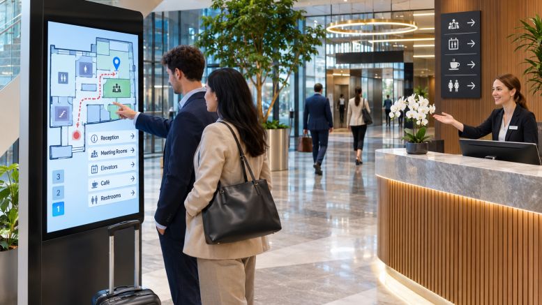
Reception starts before a visitor reaches a desk. In an airport, hospital, office campus, shopping center, or event venue, the first test is often simple: finding the correct entrance, floor, room, or service. Indoor maps reduce this initial uncertainty, guide people through unfamiliar buildings, and give reception teams a more reliable way to manage arrivals without multiplying signs or staff interventions.
Reception begins before the front desk
Large buildings create friction because visitors rarely understand their internal logic. Different entrances may serve different departments, elevators may not reach every floor, and identical corridors can make orientation difficult. Static directories provide a snapshot, but they cannot calculate a route, account for a closed passage, or guide someone from a parking area to a specific desk. An interactive indoor map turns the building into searchable information, allowing visitors to locate rooms, services, restrooms, elevators, check-in points, and exits from a phone, kiosk, website, or venue application.
This guidance changes the role of reception staff. Instead of repeatedly describing the same route, employees can focus on check-in, security, accessibility requests, and complex visitor needs. When a business operates several floors or sites, a platform such as Visioglobe can connect floor plans, points of interest, adapted routes, and operational updates within a consistent mapping environment. The information remains useful before arrival as well: a route included in an appointment confirmation can show the correct entrance, estimated walking path, reception point, and reserved room. Visitors arrive better prepared, queues become easier to manage, and the first human interaction is less likely to begin with confusion or frustration.
Clear routes improve inclusion and trust
An effective indoor map does more than display walls and corridors. It must reflect how different people move through the building. A step-free route may require another entrance, a quieter path may help visitors who struggle with crowded areas, and instructions based on visible landmarks can be easier to follow than a sequence of distances. Language options, readable labels, strong contrast, screen reader compatibility, and alternatives to gesture-only controls also determine whether the map genuinely supports reception. The W3C work on cognitive accessibility published in 2026 identifies memory, attention, language, spatial processing, and route interruption as important indoor wayfinding challenges. These factors make clarity an operational requirement rather than a decorative feature.
Route quality must also be tested rather than assumed. A 2026 research project that converted floor plans into accessible navigation instructions achieved a 92.31 percent success rate for short routes on one evaluated floor, compared with 61.54 percent for long routes. The floor plan navigation results underline a practical point for businesses: performance can decline as routes become more complex. Teams should therefore test journeys that involve floor changes, restricted areas, temporary closures, and similar destination names. They should also invite visitors with reduced mobility, low vision, cognitive disabilities, or limited knowledge of the venue’s main language to participate. A map that works only for employees familiar with the building will not improve reception for first-time visitors.
Successful deployment starts with operational choices
Businesses should begin with the journeys that generate the most questions or delays. Reception logs, staff interviews, search data, appointment records, and observations at busy entrances can reveal recurring problems. A hospital may prioritize routes from parking to outpatient departments, while an office campus may focus on visitor registration, meeting rooms, and reserved desks. A shopping center may need store search, accessible entrances, amenities, and routes from each parking zone. The first version should cover these high-value journeys before expanding to every room or asset. A limited pilot also provides measurable indicators, including route completion, abandoned searches, requests for directions, late arrivals, kiosk usage, and the time reception staff spend giving basic guidance.
Budget planning should separate map creation from the wider service. Costs may include floor plan preparation, interface design, content management, positioning technology, kiosks, integrations, testing, staff training, and maintenance. Businesses that already have accurate digital plans can often reduce initial production work, while venues requiring precise live positioning may need additional infrastructure. Procurement teams should request a pilot, define update responsibilities, and confirm how quickly temporary closures or room changes can be published. They should also examine current accessibility, tourism modernization, or smart-building funding programs where eligible. Reservations deserve particular attention: connecting the map with appointments, parking bookings, room schedules, or event registration can give each visitor a relevant route before arrival. The project becomes easier to justify when the budget is tied to measurable reception outcomes rather than treated as a standalone display upgrade.
A map becomes part of the welcome
Indoor mapping improves reception when it combines accurate routes, accessible design, current information, and disciplined operations. The strongest projects start with real visitor difficulties, test complex journeys, and connect navigation with bookings and assistance. The result is a calmer arrival, a lighter front-desk workload, and a building that feels understandable from the first step.
Be the first to comment on "Why businesses use indoor maps to improve visitor reception"